We print this zine only for events and hand it out at Global Gathering
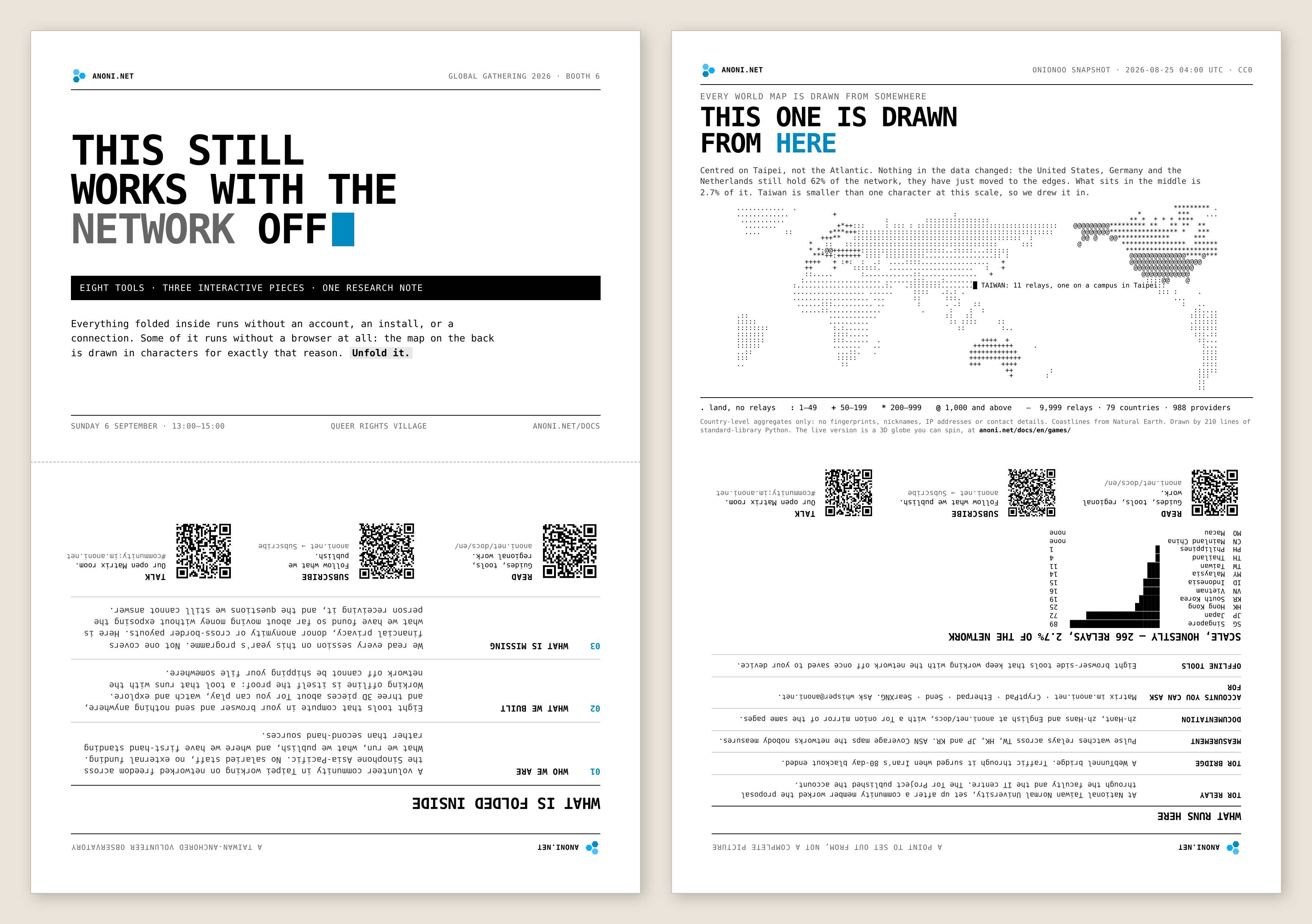
From 4 to 6 September we have a booth at Global Gathering 2026 in Estoril, Portugal, where we hand out a printed zine. Four A4 sheets folded in half inside a wrapper, A5 when folded. We printed 150 copies, they go until they run out, and there is no digital edition.
anoni.net is a volunteer community based in Taiwan, working on documentation, measurement tools, and self-hosted services for anonymity networks and networked freedom.
- Booth slot: Sunday 6 September,
13:00to15:00 - Where: booth
6, Queer Rights Village - What you can do there: take a zine, try eight browser-side tools that work offline and three interactive 3D pieces about Tor (the onion routing network), discuss anonymous payments
- We are around all three days, so stop us anywhere at the venue outside the booth slot
Who the zine is for: anyone working on cross-border disbursement, donor anonymity, or a project blocked by financial controls. One of the sheets is written for you.
This article is the design record, written for people interested in typesetting and print, including the places we got wrong and fixed. For why we are attending, why the booth topic is anonymous payments, which sessions overlap with our work, and five other ways to find us, read anoni.net at Global Gathering 2026. The full event information is in that earlier post.
The booth slot is two hours long
The booth runs on Sunday afternoon, two hours long, staffed by two of us.
Someone walking past will stop for thirty seconds to two minutes. That is not long enough to describe a community, and not long enough to explain the anonymous payments research out loud. So there had to be something to take away.
The first decision was print, with no digital edition.
A PDF goes online, the reader scans a QR code, saves it to a phone, and mostly never opens it again. A printed sheet gets folded into a bag, read once more on the flight home, spread on a desk holding down other paper, or handed to someone else. In a two-hour window, a thing that can be carried away has better odds than a thing that can be scanned.
A web page can be edited at any time, and yesterday's mistake gets corrected today without anyone noticing. Print cannot be revised once it leaves the machine, so typos, misjudgements and figures that have gone stale all remain on the page. Writing for it slowed us down considerably.
150 copies is our estimate of what three days will absorb.
The sheets still carry three QR codes, pointing to the docs site, the newsletter, and the community Matrix room. No digital edition, and the scope of that is this printed object, since the sources for the content are all on the site where anyone can check them.
Measuring how much fits on one sheet
We had no reliable basis for judgement before starting, so we produced the finished pieces and measured them afterwards.
The A4 content area after margins is 186 × 275 mm, or 512 square centimetres. Each page carries between 574 and 808 words, which works out at 1.1 to 1.6 words per square centimetre.
Density is tied to reading distance and does not survive a change of format. Line length is unaffected by format, so it carries straight over.
Running pdftotext -layout over the finished PDFs to recover the line structure puts single-column line length between 58 and 68 characters, with a median of 63. The classic readable range is 55 to 75 characters per line, which puts us in the lower middle. The corresponding parameters are a 89.5 mm column, 8.3 pt body text, and a line height of 1.40.
Line height mattered more than we expected: at the same word count and the same type size, 1.40 against 1.8 is a difference of nearly thirty per cent of vertical space. We opened the leading up at first for readability, and every block ended up with a wide band of white underneath it, so a reader covers more distance with their eyes for the same content. We did not go back and run type size as a second variable, so the honest claim is that we underestimated line height, not that it outranks type size.
Every dense passage uses the "label: explanatory text" structure, which gives the eye somewhere to land every two or three lines. The densest page across the four pieces carries six parallel items written the same way, and it puts the smallest load on the reader of any page in the set. It is the only approach we tried, with no comparison against extra white space or bullet markers, so we can say it works and not that it works best.
One sheet holds one claim
An A4 side holds about 800 English words. Not enough to describe a whole community, only enough to make one point. If we could not say what a sheet argued, the content was not ready.
Who we are: what we run, and where we only have second-hand sources. We deliberately included a section setting out how much standing we have in each jurisdiction, since Taiwan is the only place we speak about first-hand and Mainland China, Hong Kong and Macau are followed through public sources. Representation is the first thing questioned at an international venue, and saying it before being asked beats conceding it afterwards.
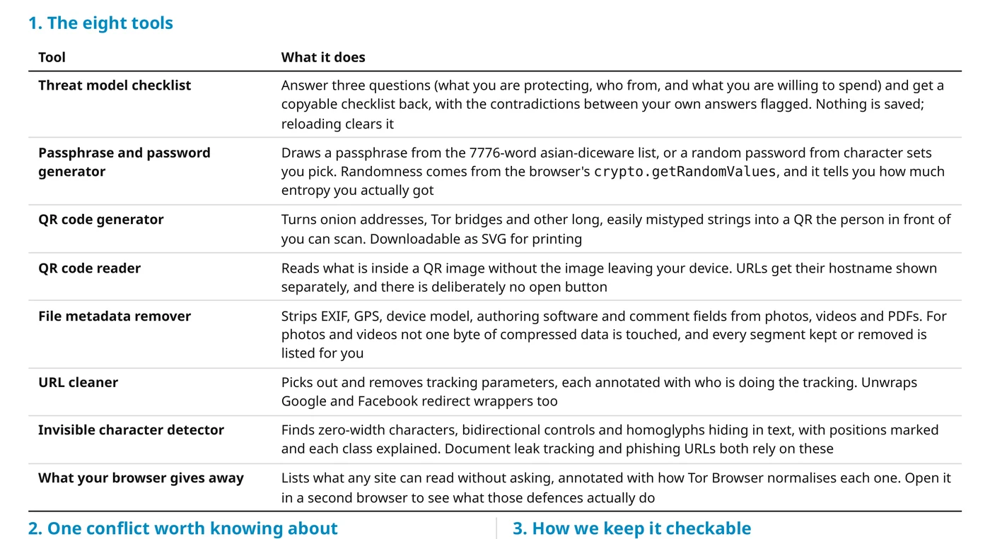
What we built: eight browser-side tools and three interactive 3D pieces about Tor. It opens on the line that working offline is itself the proof, since a tool that still runs with the network switched off is not sending your file anywhere, and a reader can check that in ten seconds.
Anonymous payments, interim: the only sheet carrying a version number and a date, marked v0.1. The research has no conclusions yet, so the sheet holds the observations so far and the questions we still cannot answer, with a block set aside on the back for collecting cases.
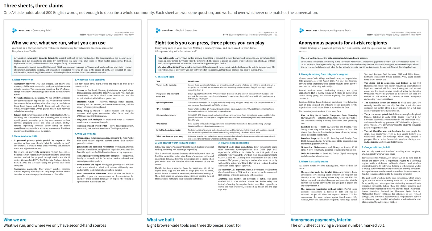
Three separate sheets, with no booklet made out of them. Some people ask what the community does, some react to the tools on the table, some bring up money, and the right move is to hand over whichever sheet matches the conversation in front of you.
The cover went through the most versions
The cover changed more times than any of the other three sheets.
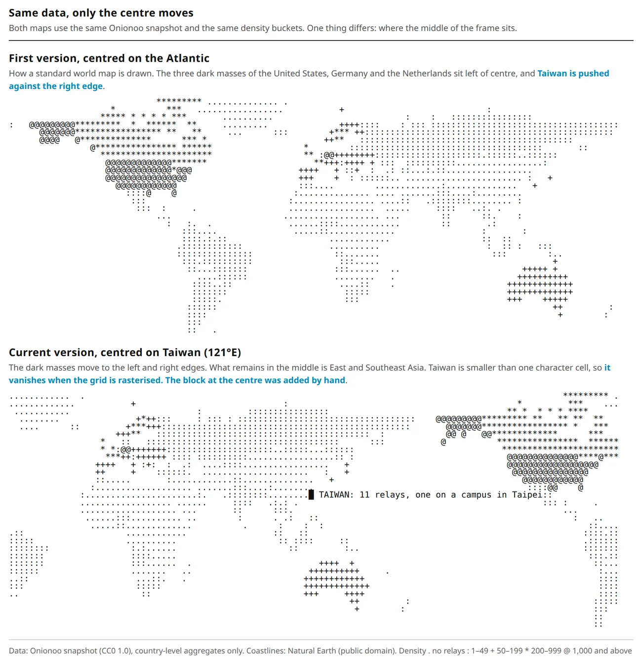
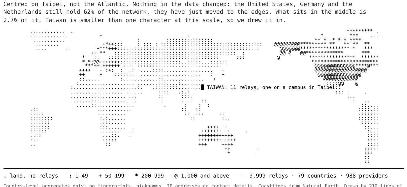
The first version was headed "Three countries hold 62% of the Tor network", over a standard world map. The figures themselves are sound, with the United States, Germany and the Netherlands coming to 62.3% and East and Southeast Asia together accounting for 2.7%.
We were unhappy with it once the page was laid out. The sentence only accounts for what is missing, it leaves nothing to say next, and the position it hands the reader is that of a victim. Our first sentence at an international venue should not stop there.
The fix took one action, moving the projection centre from the Atlantic to Taiwan.
A standard world map pushes Taiwan against the right edge, so the position at the margin is settled before a word is written. Re-centring on 121°E changes none of the data, and the three dark masses move out to the left and right sides of the frame. What remains in the middle is a faint wash of full stops and colons, which is the region we work in.
Then Taiwan disappeared
The first run after the change came out without Taiwan on it.
At that scale Taiwan is narrower than one character cell, so no cell centre falls inside it when the grid is rasterised.
We did not subdivide the grid. No finer version was built for comparison, and the reasoning was that finer cells would fragment everything else, and that going that way would also dodge the question. Instead the marker goes on after rasterising, a solid block placed from the centroid coordinates with a leader line of characters running to its right.
Redrawn from Taiwan, the ink sits at the edges and the centre holds one block put there by hand. That gap is the thing we came to say.
Why the map is set in characters
Each character stands for one grid cell, and how dark it is corresponds to that country's Tor relay density. The data comes from the same Onionoo snapshot used by the community's 3D globe (Onionoo is the Tor Project's service publishing relay status), aggregated to country level only, with no fingerprints, nicknames, IP addresses or contact details.
We set it in characters instead of exporting an image. A page of characters photocopies without blurring, reads in a terminal, and holds its shape pinned to a wall from across the room, with no browser and no connection required. The tools inside share that property, and keep working with the network off.
The problems we hit while laying it out are recorded in the generator's comments.
A monospace cell is not square: it runs roughly 0.6 wide to 1.0 tall. The first version divided latitude and longitude at the same resolution, which stretched the map vertically by a factor of nearly 2.7 and left Africa and South America long and thin. Row count has to compensate for the character aspect ratio.
Density buckets cannot be set on the numbers alone: the first version gave the 10 to 49 band a heavy character, and the block for Russia, 26 relays across an enormous landmass, took more visual weight than the point we built the map to make. The current buckets put exactly three countries in the top band.
Small islands vanish: Taiwan is about 1.5 degrees wide, so at three degrees per column it lands inside no cell at all.
The copy shop settled the visual direction
Neon on black was our first direction, and we dropped it after working through what it would take.
Full-bleed dark areas do not print: a copy shop's laser printer streaks across large dark areas, the toner transfers onto hands and onto the sheet next to it, and the paper curls. Four sheets folded together make all of that worse.
Gradients are out under the brand guidelines anyway: the community's primary colour is a highly saturated bright blue, which shifts dark and purple in four-colour print, and large flat areas show it most.
The audience: the venue is full of digital rights practitioners and funders, and our judgement is that a heavily styled piece reads as unserious there. The first two are printing conditions and can be confirmed in advance, while this one is a guess about readers, and September tells us whether the guess was right.
What came off the printer looks like a terminal: white paper, oversized monospace headings, hairline rules, generous white space, a single reversed band across the whole piece, and nothing running to the edge of the sheet. Three constraints each ruled out part of the option space. What survives prints cleanly, keeps the toner off your hands, and reprints at a copy shop without shifting, and the neon version manages none of the three.
The body is set in a serif face, black on white, with a version number and a date, so the whole thing reads as a working paper. The register is deliberate, and it matches the research-stage framing printed on the anonymous payments sheet.
Both sides of the wrapper are covers. Four sheets fold in half to A5 landscape and either side works facing out. The two covers are a deliberate pair, one about what we built and one about what the view from Taiwan looks like. All three QR codes appear on both sides, since which face ends up outward is not fixed. The side effect is that the cover folded inward only appears once the wrapper is opened.
The lower half of each side is a back cover, printed rotated 180 degrees. That is part of the imposition: the pages are arranged in folding order before printing, so the panel reads the right way up once it wraps around to the back.
One print run per event
A print-only piece is what we make for every event we appear at. Each booth or workshop gets its own run, the content is set by whatever work is under way at the time, and nothing is reprinted once the event is over.
The content goes stale, and that is deliberate. The anonymous payments sheet is marked v0.1, and by the next event the research will have moved, so what comes off the printer will not be the same sheet. This particular version exists across three days at one venue.
Come and find us
No appointment needed and no need to prepare a topic. When the 150 copies are gone they are gone, so come early if you want one. Stop us anywhere at the venue outside the booth slot, and five other ways to find us are listed in the previous article.
The back of the anonymous payments sheet carries five questions we still cannot answer. Answering one of them helps us more than taking a copy away.