Tor Relay Globe
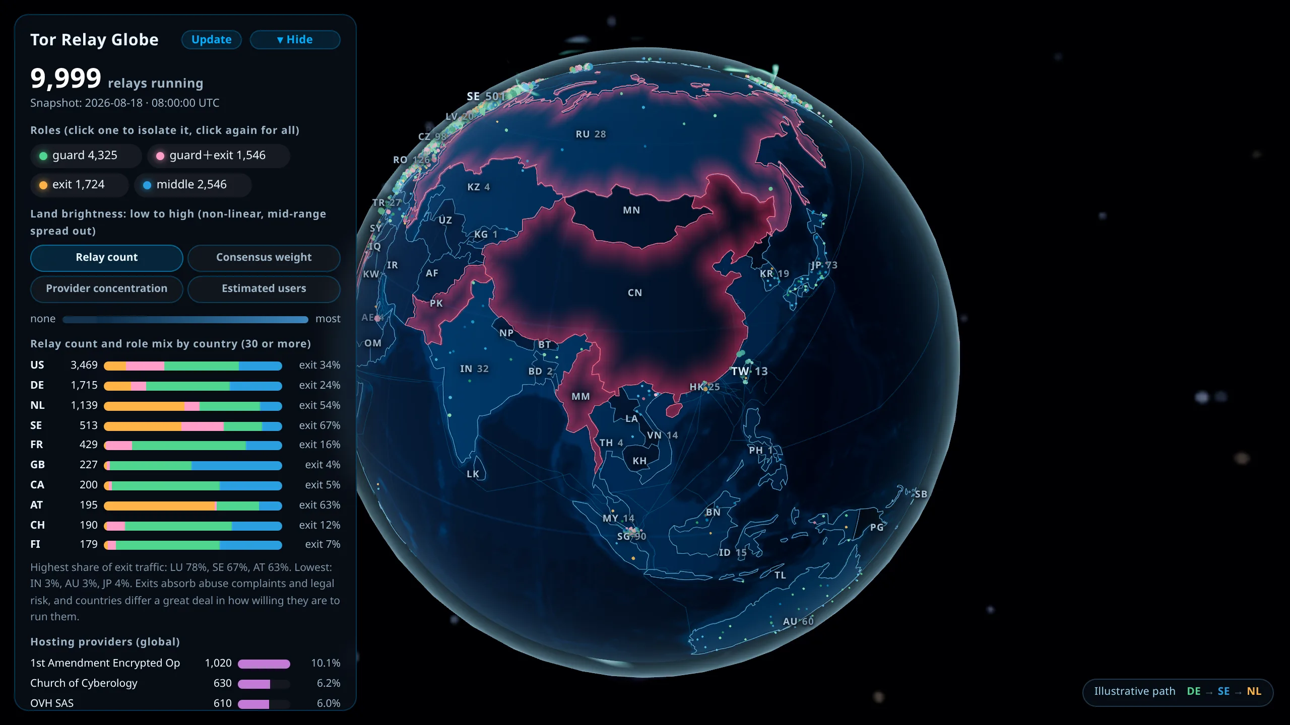
Of the three works, the globe pulls in the most data. It puts public datasets scattered across different organisations onto one sphere, so that "where relays can be run" and "where Tor can be reached" can be read side by side. Zoom in on Taiwan and one more layer appears: the physical infrastructure those connections actually depend on.
Not sure where to start, take the tour
Click "Start the tour" in the left panel, or open the URL with #tour. The globe walks through seven stops in order: the global spread of relays, the gap between relay count and consensus weight, where connections run into trouble, estimated users, where Taiwan sits, the physical layers underneath it, and further reading at the end. Space advances a stop, the arrow keys move back and forth, Esc leaves.
This is built for workshops and classrooms. The work and its data sit in the automatic offline list, so once the page has been opened to store it, it runs with no network at all. You can drag the globe at any point during the tour, and the next stop brings the camera back to where the script wants it.
When a dataset fails to load, the stop that needs it is dropped and the count adjusts.
Pick the layers you want
The globe itself, bathymetry, Tor relays and blocking observations load at startup. The other eleven layers sit in the row of chips at the top of the left panel: tap one and that dataset is fetched and drawn, tap again and it is removed. Layers you never tap cost nothing.
Compressed, the fourteen datasets come to 800 KB. The four that load at startup account for 429 KB, so arriving costs a little over half. The two heaviest items on the on-demand side are the coastlines at 237 KB and the five Taiwan layers at 95 KB. Coastlines only sharpen the land and sea boundary, which the borders and the land fill already make legible, so they sit on the on-demand side.
The URL follows your choices, so copying the address bar hands someone else the same stack. You can also write it directly: ?layers=tw-power,tw-grid opens just the substations and the grid, and an empty ?layers= leaves only the globe itself.
Starting the tour pulls in whatever its seven stops need, so there is no need to tap the layers open beforehand.
What is on the sphere
Each relay is one dot placed inside its own country's border, coloured by its four possible roles (guard, middle, exit, and guard plus exit) and sized by bandwidth. Landmass brightness carries a separate metric, relay count by default.
Drag to rotate, scroll or pinch to zoom and more country labels surface. Adding #tw to the URL flies straight to Taiwan on load, and other country codes such as #jp work the same way, so a shared link can decide what the recipient sees first.
Landmass brightness switches between metrics
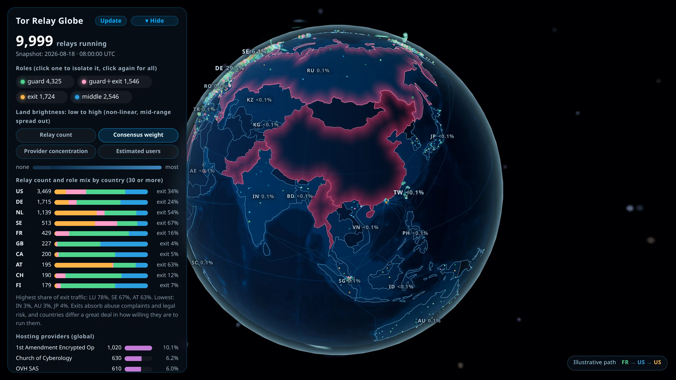
- Relay count: how many relays the country hosts
- Consensus weight: the share of traffic the country actually carries in the Tor network, which often diverges noticeably from the raw count
- Single-provider concentration: what fraction of a country's relays sit with its largest hosting provider, showing how dependent it is on one operator
- User estimate: the estimated number of Tor users, a demand-side figure
- Internet use: what share of the country is online. The World Bank series covers 208 economies, wider than relay coverage
Layers supply the metrics, so the row of buttons grows and shrinks with them. The first three come from the Tor relay layer; the user estimate and internet use each appear once their layer is on. Turning off the layer behind the metric you are viewing drops the view back to relay count.
The last two belong together. One is an absolute headcount, the other is its denominator, and comparing them is what tells you whether a gap between two countries is about demand or about population size.
The gap between count and weight is worth switching over to see once. The United States hosts the most relays, but under consensus weight Germany moves ahead, which means each German relay carries more traffic.
Clicking a country label opens its card
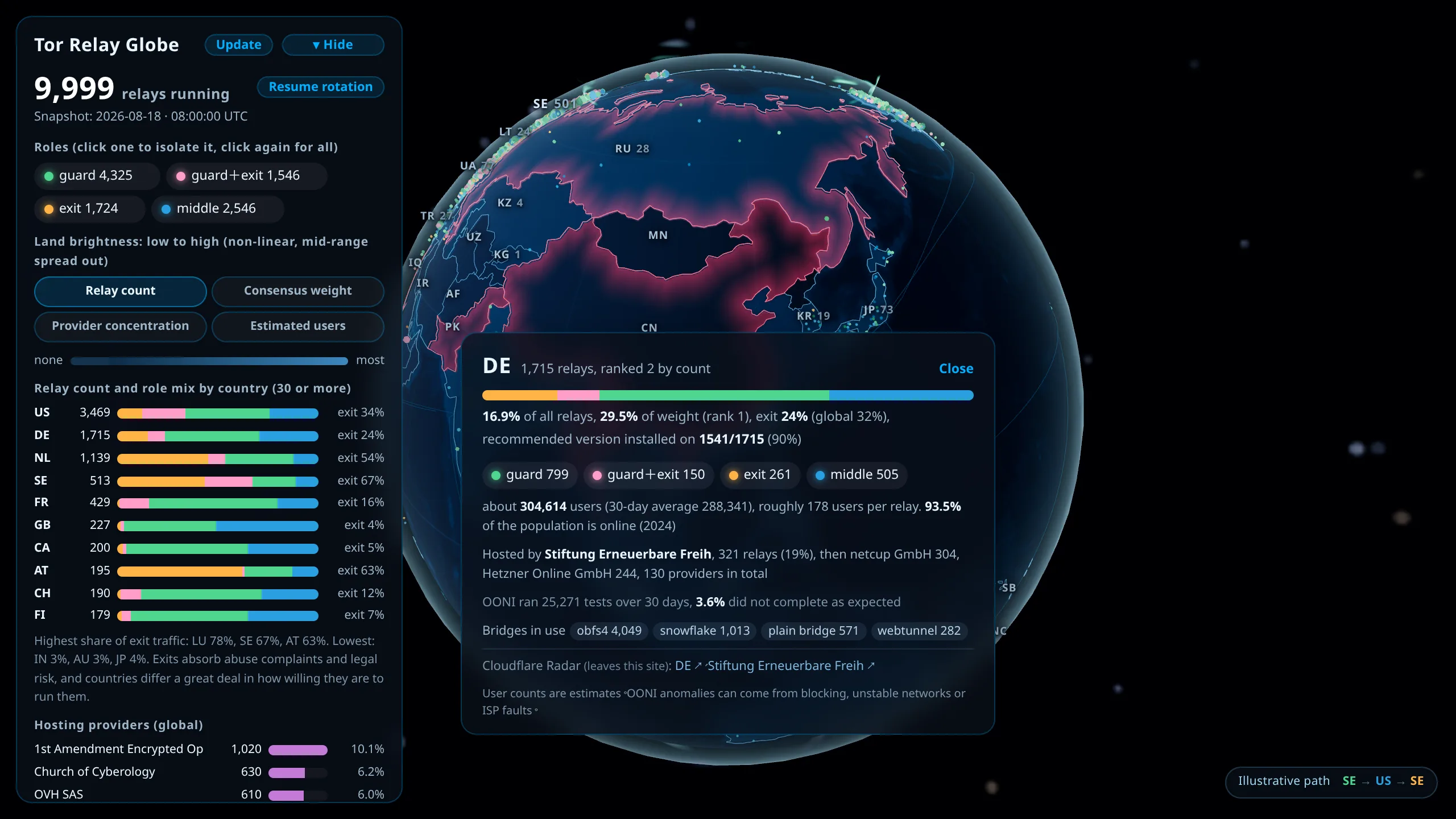
The card carries its role mix, bandwidth share, the proportion running the officially recommended version, its main hosting providers, and how the country appears in the other datasets: user estimates, the OONI anomaly rate, and the pluggable transport breakdown of bridge usage.
What the globe brings together
Relay distribution (Onionoo, CC0 1.0)
The main layer comes from an Onionoo relay snapshot, distilled down to country-level aggregates only, with no fingerprints, nicknames, IP addresses or contact details. It currently covers nearly ten thousand running relays across around eighty countries and more than nine hundred hosting providers, with the United States, Germany and the Netherlands together accounting for over sixty percent. These figures come from the most recent snapshot, whose generation time is shown on screen.
Pressing "Live update" makes your browser fetch and recompute the data directly from onionoo.anoni.net instead of reading the snapshot hosted here. That request lets the server see your IP address, so it is off by default and the choice is yours.
Where connections run into trouble (OONI, CC BY-NC-SA 4.0)
Drawn from OONI's tor test results, this is the share of tests per country over the past 30 days that did not complete as expected, which OONI calls an anomaly. Causes include blocking, unstable networks and ISP faults, and the rate alone cannot separate them. The globe therefore marks only the few countries above an 85% anomaly rate with a sufficient sample, and leaves mid-range values uncoloured entirely. The threshold sits that high because countries with no censorship concerns, such as Switzerland and Canada, routinely land around twenty percent, and colouring the middle of the range would amount to accusing them on the strength of noise. Marked countries are drawn with a red gradient fading inward from the border, so a neighbouring country that is not marked cannot be misread as equally affected.
Users and bridges (Tor Metrics, CC0 1.0)
Two figures. One is the estimated number of Tor users per country, the other is bridge users broken down by pluggable transport into obfs4, snowflake, webtunnel and others, covering more than two hundred countries. Reading them together often reveals a meaningful gap: where direct connections are blocked, the bridge numbers run noticeably high.
Shutdown records (Access Now #KeepItOn, CC BY 4.0)
Internet shutdowns from 2009 to 2025, compiled and verified case by case, covering over fifty countries. This dataset differs in kind from OONI: every entry has a verified cause, so it can state plainly that a deliberate shutdown occurred. Outages caused by armed conflict or communal violence do not necessarily follow a government decision and may result from infrastructure damage, so the globe keeps them separate from information-control cases.
Submarine cables and base geography (OpenStreetMap ODbL, Natural Earth public domain)
The finer lines over water are submarine cables, taken from the two hundred-odd routes mapped by OpenStreetMap contributors, with the best coverage across Europe, the Mediterranean and the Atlantic. The faintest layer sketches the major transoceanic corridors, drawn as great-circle arcs between publicly documented landing points, so only the general direction is reliable and actual routing should be checked against a dedicated cable map. Borders and coastlines come from Natural Earth at the 10m scale. The East Asia zone covers the southeastern Chinese seaboard, Taiwan, Japan, Korea, the Philippines, mainland Southeast Asia, the Malay Peninsula and Sumatra. Coastlines there are simplified to about 220 m, or 2.3 km between adjacent points, and borders to about 330 m, or 2.8 km. Both layers have to sit at the same order of magnitude — let one get much coarser and you end up with a smooth coastline running alongside a staircase of a border. The rest of Asia and the rest of the world are progressively coarser, because most readers here are in East Asia. In Europe and the Americas the spacing runs to tens of kilometres, so islands come out as a few points joined by straight lines, which reads as a row of blocks once you zoom in. Land fill takes a different route: it is painted into a texture and wrapped onto the sphere. The global texture is 2048x1024, one pixel at the equator covering 19.6 km, which leaves Hong Kong with 3 pixels, a smear whose edge misses the coastline by a dozen kilometres. East Asia gets a second texture, 2048 square, at 2.8 km per pixel, and Hong Kong becomes 147 pixels. Macau, at 33 square kilometres, is still only 4 pixels there, so its shape has to be read off the vector border line.
Regional borders in East and Southeast Asia (DATA.GOV.HK, Natural Earth public domain)
Zoom in on Japan, South Korea, Hong Kong or a Southeast Asian country and a layer of fine lines fades in over the land: Japan's prefectures, South Korea's provinces and metropolitan cities, Hong Kong's 18 districts, and the provinces and states of eleven countries including Vietnam, Thailand, the Philippines and Indonesia. It is the same thing that happens with county borders when you zoom in on Taiwan. Each country's borders are a separate small file that is only fetched when the camera gets close to that country, and they are only drawn once a typical division is large enough on screen, which is why Japan's prefectures appear before Hong Kong's districts. Only the edges shared by two neighbouring divisions are drawn, and the outline is left to the country borders and coastline, so isolated islands under sovereignty disputes are not drawn into any country. Hong Kong's district boundaries come from the Home Affairs Department of the Hong Kong SAR Government, published on DATA.GOV.HK and used under its Terms and Conditions of Use. The source assigns the surrounding sea to districts as well, and only the parts on land are kept here. The other countries have no official source that is easy to obtain yet, so they use Natural Earth's first-level divisions, which are coarser up close (for Hong Kong the difference is thirtyfold) and not current everywhere: Indonesia split new provinces out of Papua in 2022, and this still shows the old 33.
Internet usage rate (World Bank CC BY 4.0, Ministry of Digital Affairs)
The internet usage rate on each country card exists to serve as a denominator. "How many people in this country use Tor" is in large part a comparison of population size; knowing what share of a country is online is what tells you whether a gap between two countries reflects demand or just headcount. The World Bank series covers 208 economies but not Taiwan, so the Taiwanese figure comes from the Ministry of Digital Affairs' national digital access survey instead. The two use different methods — one aggregates national reporting through the ITU, the other is a telephone sample of people aged 12 and over — and the card says so, because they should not be compared directly.
Zooming in on Taiwan
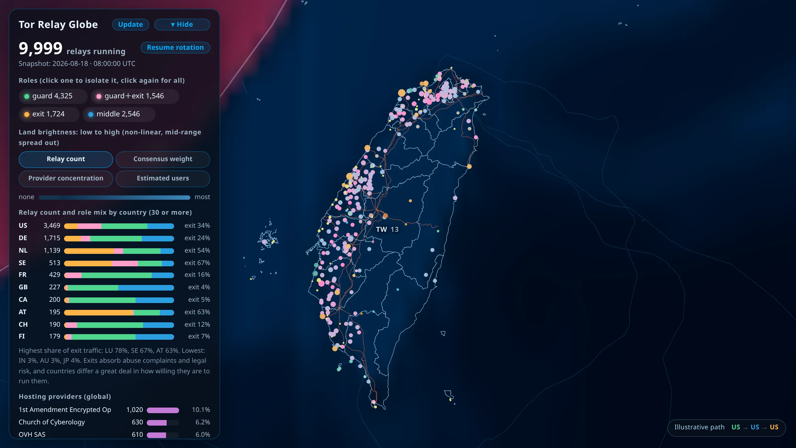
Taiwan is the only region on this globe drawn down to county scale, and approaching it brings up five more layers. The left-hand panel groups everything Taiwan-related together, and the "Focus Taiwan" button flies straight there.
- County boundaries — the Ministry of the Interior's municipality and county boundaries, 22 counties across 84 rings. It doubles as Taiwan's coastline, because the global coastline is too coarse at this scale, so the rough outline is swapped for it as you approach.
- Cable landing points — 14 of them, a dataset we built ourselves. Landing point coordinates are part of TeleGeography's commercial product and OpenStreetMap does not carry them, so we took the Ministry of Digital Affairs' public cable list as the spine and cross-checked each coordinate, recording a precision grade and its own sources for every entry. This v1 is incomplete and the gaps are listed in the header of the source file.
- Substations — Taipower's installed and reliable capacity for secondary substation main transformers, 280 sites, 201 of which can be placed on the map. The gauge on the card turns N-1 into visible geometry: the hatched band between the reliable-capacity tick and installed capacity is exactly the largest main transformer, the part that disappears when it fails. Nationwide, 64 sites have a peak load above their reliable capacity, which means losing one transformer at peak would leave the rest short. That is a separate question from whether the site is overloaded today.
- Power plants and the 345 kV backbone — 105 plants and 242 transmission segments. Only 17 plants can be located, but those 17 already account for 71% of installed capacity; the ones that cannot are mostly offshore wind and small hydro. Nothing below 161 kV is drawn at all, so this is not a complete grid.
- Demand and renewables — 93 Taipower-owned renewable sites, 124 months of county-level electricity demand, and 212 days of this year's daily peak operating reserve margin.
Plants, substations, renewable sites, landing points and transmission lines can all be clicked for detail.
Demand reads two ways
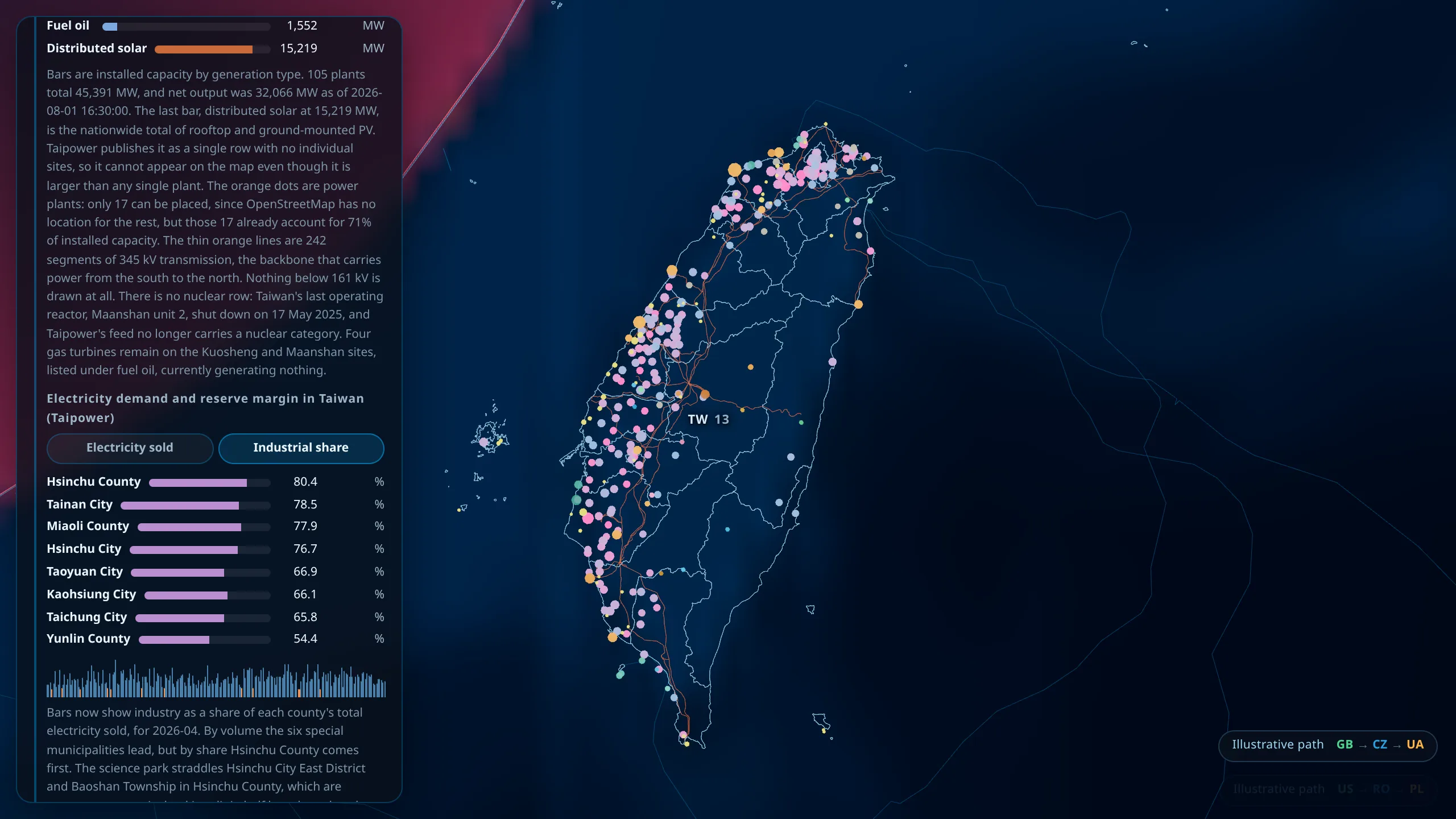
By total consumption the six special municipalities lead. Switch to industrial share and Hsinchu County jumps to the top, which is what the science parks look like in this dataset. The park straddles East District in Hsinchu City and Baoshan Township in Hsinchu County, two separate administrative rows, so a total splits it in half while a share does not.
The thin bars underneath are this year's daily peak operating reserve margin, with anything below 10% turned orange, Taipower's own threshold for a tight supply day.
What moves on the globe
Beyond the datasets above, a few more layers are rendered rather than fetched.
The day-night terminator follows the subsolar point computed from UTC, so it tracks real time and the seasonal variation in day length falls out automatically, with no external request involved. There are also auroras, atmospheric rim light and stars.
The occasional Tor three-hop path animation sits between the two categories. Its endpoints are taken from real relay positions, so which countries get picked reflects the real distribution, but the combination of the three points is illustrative and does not model Tor's actual path-selection rules.
Sources and licensing
Every data file carries source, sourceUrl, license and licenseUrl fields, and the corresponding credits are listed below the globe. The full licence list lives in NOTICE at the root of the project, where the OONI entry is CC BY-NC-SA 4.0 and prohibits commercial use.
Further reading
- Where the globe's data comes from: Where the globe's data comes from
- How Tor actually works: What is Tor?
- Anonymity and what it does not cover: Anonymity vs privacy
- Running a relay and watching the network: Tor relay watcher
- The other two works: Interactive